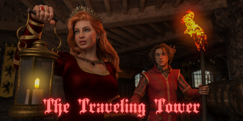
The queen and her prince seek refuge in a magical tower. But they don’t find the safety they sought. The building has a mind of its own, and other nefarious creatures share the long halls and disapproving rooms with them.
If you have an opinion, please leave your feedback on the latest chapter below. Your comments are helpful in navigating the course of future projects.
Illustrations by Lexx228

This content is limited to (Rawly Rawls Member Plus), (Rawly Rawls member Elite), & (Rawly Rawls Member Max). To view this content please upgrade your Membership Plan.
[rr-star-review]

What happened?
This story was getting updated regularly, and now nothing the last 4 months. Lexx has been plenty active too.
Lexx has stuff going on that has slowed him down. He’s hoping to get back on a regular schedule soon.
Please make Hestia and the prince mate
The illustrations are excellent
Lexx228 is doing good work, as usual.
I really do like the illustrations in chapter 5. Well done!
classic Lexx228 W. The only 3d artist to equal redoxa.. if not best
Thank you all for the comments. We’ll go with lighter images for future chapters.
I prefer the lighter version
Lighter
Lighter version here
To me, the lighter could be a bit lighter. I do prefer the lighter over the darker as you can see more of the dtail in the graphic. Plus it is easier on my old eyes
Lighter
I prefer the lighter version.
Light is better
Lighter version is the best one Thx for the change Rawls
When given an option between one or the other, i would usually say: “Why not both?”… But as someone who DOES render out images on a fairly regular basis now, i can understand why you’d only wanna do one.. To be honest, the lighter version is superior, in my opinion. The dark version was TOO dark.
I prefer the lighter version, it’s easier to see the details
Goodness, the light version is clearly much better. I don’t think we lose the overall tone of the scenes, since there’s still a good amount of contrast and shadow, but we can actually see what’s going on with all the characters in the light version.
I prefer the lighter version, it’s easier to see the details (at least on my monitor). The dark one might be more atmospheric, but ultimately the art is so nice I want to SEE it! 🙂
Both the “light” and the “dark” look the same. I fail to see a difference in the way the story is being presented. The art is excellent and the story has my attention. Awaiting the rest anxiously!
I was talking about the amount of light in the illustrations.
This is tough!
Some illustrations are better light and others dark.
In general, lighter is probably better over all.
Love the story but the pictures are so dark I can barely the outlines of the female characters would it be possible to lighten or brighten the pictures or at least add more fire torches in hall way
Good start, and AMAZING quality art! Looks so great, can’t wait to see more 🙂
I was already enjoying the story, but now I’m really enjoying the illustrations as well. Amazing work!
🙂