Princess Na’Seen Ch. 1 to 5

  • Post author:

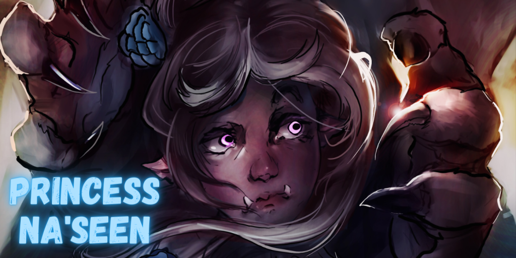
A goblin princess is engaged to be married to the prince of a rival nation across the valley. On her journey, men attack her convoy. The princess is lost in a forest of strange creatures. To make matters worse, she is under the enchantment of a betrothal spell that makes all who see her fall in love.

If you have an opinion, please leave your feedback. Your comments are helpful in navigating the course of future projects.


Illustrations by Heall: https://twitter.com/HeaIl__

This content is limited to (Rawly Rawls Member Plus), (Rawly Rawls member Elite), & (Rawly Rawls Member Max). To view this content please upgrade your Membership Plan.

3.1 out of 5 dark stones (based on 36 reviews)
Excellent36%
Very good17%
Average8%
Poor3%
Terrible36%

Leave a Reply

This Post Has 10 Comments

  1. Anteater

    I love chapter 4! Who knew the Princess would start seducing?

  2. Noat

    This is great! I like this version of the story. The art is good and unique, and the art got better just from chapter 1 to 2. I am very excited to see what is to come. The story Is interesting too, I am into goblin women. Tge story Gives me an episodic feeling with new characters at each chapter. Chapter 2 was fun, love the nymph. The illustration where she was floating in the air above the cottage and getting ready to attack was soooo cool.

    1. Anteater

      Chapter 2 was great. In fact, this nymph is quite taken by the princess.

  3. Kol_Kleurplaat

    I like the story but the artwork is really blurry sadly, there is a lack of defining lines and shadows. some times its all one big mess

    1. Heall

      Hey, artist here, will try to take that into account next chapter 😉 cheers

      1. Kol_Kleurplaat

        Hey, I wanted to come back to my comment from a few months ago. You did indeed improve your work. Nicely done.

  4. Karvasius

    I love the artwork. I think a slight defining of some of the edges would make it a bit better but overall very well done. Excited to see where this one goes especially if you can tighten up the edges a bit.

    1. DM1485

      I hafta agree here.. things are a bit too….fuzzy, blurry….lacking in definition.

      obviously, it’s clear to see what things are, but everything’s a little too indistinct for my taste.. The coloring is great though. While it’s not my favorite, and not as good as the last two iterations, this art style isn’t offensive to my eyes, and it wouldn’t be the worst thing in the world if this artist was the one who finally sticks around past chapter two.